The Story
As I sifted through some pages in the Museum Plantin-Moretus’ reading room during the Expert class Type design at the Plantin Institute of Typography, one type caught my eye. This type, made by a not-so-well-known punchcutter, was robust yet elegant, suitable to be read with ease despite its extremely small size. As it turns out, this type was Haultin’s Petite Nonpareille Romaine.
Pierre Haultin (c. 1510–87), a French punchcutter contemporary of Robert Granjon (c. 1513–90), probably dreamt of carrying his books around without fear of being encumbered. At the very least, he strove towards innovation and made types in very small body sizes. To make these small letters easy to read, he made them sturdier, heavier, narrower, and gave them a greater x-height than what was the norm at the time.
Haultinʼs types were a resounding success and remained popular well unto the eighteenth century. His very small body sizes (5,8 pica points) defied what was thought to be impossible to print. Printers in Geneva started to use this type in 1553 for a series of compact octavo bibles. Haultin later made italics in the same body size.
There are two matrix sets of Haultin’s Nonpareille Romaine in the Museum Plantin-Moretus — ma067 and ma065.
My aim was to make a text typeface with unequalled legibility at small sizes. I started by setting the vertical metrics. I decided on giving the ascenders an extra height of 50% of the x-height, the descenders 35%, and the capitals 33%. I based the design mainly on Haultinʼs Petite Nonpareille Romaine and incorporated some Granjon features.
To make it easier to read at small sizes, I found a low contrast to be important. The low contrast in Haultinʼs type is perhaps more a result of printing limitations than intentional design, though it turned out to be a happy accident. I decided on a general contrast ratio of 40%. I also enforced a minimum thickness to avoid any unprintably thin lines. The only exceptions to this rule would be for sharp points and optical compensation.
I decided to call this typeface La Singulière, meaning “The Unique” — an allusion to La Nonpareille, meaning “The Unrivalled.”

Print of the ma067 matrices found in the “Index sive specimen characterum Christophori Plantini” from 1567

Microscopic image of the same print

A few matrices from the ma065 set

Haultin also made Greek types in different body sizes. His Greek types, along with Granjonʼs, were very popular copies of the Grecs du Roi. The smallest body size Haultin made was a Bible (7,6 pica points) — the matrix set ma140 can be found in the Museum Plantin-Moretus.
After doing some research into the origins of these Grecs du Roi, I decided to try to preserve the fluidity and the organic nature of the Greek script. To do this, I followed the matrices quite closely and didnʼt worry too much about forcing the shapes to reach the x-height. The width of the letters vary significantly, and so does the stroke thickness, to maintain an even colour. The stark differences between the individual letters end up improving character recognition.
The Greek proved to be a challenge due to its many ascenders and descenders. In the Latin, apart from the g, the protrusions do not have much intricacy. The lack of room for these provided some interesting results.
The challenge of the Cyrillic for a font such as this one, is that it does not have a historical equivalent to the Latin and the Greek. Cyrillic as we know it today was introduced in 1708 by Peter the Great. For letters such as the к, I found a simple copy of the Latin version to be unsatisfactory. I decided to take the earliest examples possible, and make them match the Latin in style and construction.
I was also adamant on giving letters д and л their older forms — the triangular construction — instead of the modern rectangular one. Most importantly, that makes them more distinguishable, as the rectangular forms make them easily mistaken for other letters (I find there are enough rectangles in Cyrillic). I included stylistic alternates in case legibility were not a concern.
For the italics, I looked for something that would be easily identifyable as italics in a sea of romans. I settled on Granjonʼs Ascendonica Cursive (20 pica points). This unique Granjon model was cut in 1570 for Plantin.
I used two matrix sets (ma122 and ma183) and a set of punches (ma025) in the Museum Plantin-Moretus. I had to adapt the character proportions horizontally, since the model was not designed for such a small size.

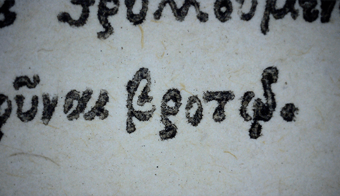
Print of the ma140 matrices found in the same type specimen

Microscopic image of the same print

Matrices from the ma140 set next to a ruler graduated in half millimetres, illustrating how small this type is

The first modern Cyrillic к, born in 1708

Matrices from the ma183 set — Granjon’s Ascendonica

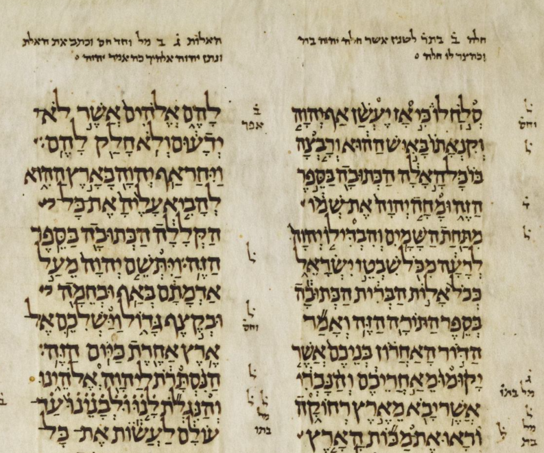
For the design of the Hebrew, I looked for a suitable model for such small sizes. I found matrices for both Ashkenazic and Sephardic styles in the Museum Plantin-Moretus. I did not find these to be what I needed. I looked further, and found another writing style called the Oriental style, as found in the “Leningrad Codex.” This codex is thought to have been written over a thousand years ago in Egypt.
The only problem — that manuscript style has never been translated into type (as far as I can tell, at least). This means I would have to create my own interpretation and adaptation to the constraints of typography, as Pierre Haultin and Robert Granjon did so many years ago. So I got out my pen, and started writing. With the design figured out, I used Le Bé’s Coronelle Hebreu matrices (ma083, which are Ashkenazic) as a basis to convert the calligraphic letterforms into typographic ones.
For the Hebrew italics, yet another approach needed to be found. The Hebrew script did not, as the Latin, develop the tradition of a secondary more fluid writing style to accompany the main text. I did find, however, that a more fluid writing style existed — and had already been translated to fit the limitations of type. This style is often called “Rashi.” So I dove into the Museum Plantin-Moretus’ archive once again to digitise this Augustine Cursive Hebraique (ma135) cut by Guillaume Le Bé. Some letters in this style had to be adapted for legibility purposes.

The “Leningrad Codex,” written in the eleventh century in Cairo

Insight into the process of adapting a calligraphic model into a typographic one

Matrices from the ma083 set

Matrices from the ma135 set

A printed example of another of Le Bé’s Cursives

